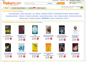
Why do people bump on an ecommerce website? The question is simple and so is the answer. Inidividuals often visit an ecommerce web site to shop on the web and that all. That basically means, an ecommerce has to be basic in structure and style and there ought to be no visual gimmick. But internet site designers who are totally aware of this concern, often fall prey to the classic site layout dilemma when they fail to maintain their creative impulse in check and churn out a site that looks truly impressive but eventually turns out to be a maze or some thing of that type to visitors. That guarantees 100% failure as majority of visitors will bounce back when they find the navigation or the design is too complex to find anything at ease. Here in this article, we are going to share some useful ecommerce web design tips that can prove highly effective in increasing the conversion rate of your website.
Make Your Shopping Cart Visible: While purchasing products online, online shoppers always want to have the peace of mind that the items were clearly registered. So, it is imperative for you to place the cart along with the check-out information in a place that can be accessed by the users whenever they want. A readily available and clearly visible checkout data can ease the pains of the users who are in the habit of checking their balance whenever they add something in their shopping cart. It can smoother their journey from shopping to checkout and we believe you will do almost anything to ensure a perfect finish of this transition. Keep the visitors happy and satisfied since it is the bottom-line.
Use Auto Complete Function: This is a powerful tool that can help your visitors to find out their favorite products while they are typing on the search box rather than after typing. It is simple yet extremely useful feature that make it easy to find out what they are looking for. After all, everyone wants to have quick access and this feature can prove to be instrumental in this regard.
If the search query did not anything, this feature can provide the closest matches so that visitors can make a better decision quickly and decisively.
Clarify The Navigation Path: – Unless you have umpteen numbers of categories in your website, clarifying the navigation path can be a nerve-wracking task. Fly out menu is certainly one of those few options that you can have to let your visitors navigate to any page of your website at any time.
But remember one thing, you should not try your artistic skills while designing the Fly out menu of your web design. Try to keep it as simple as possible. Alternatively, you can use breadcrumb navigation for the same purpose. By integrating breadcrumb navigation, you can help your visitors to trace their way back.
Add A Quick Product Review: Online shoppers do not have enough time to visit each product by clicking on them. They wish to have a quick preview option by virtue of which they can check out the details of different products without leaving the current page. This will definitely help them to sort out the best products without wasting much time and effort. A quick preview mode can go a long way to make your products visible and accessible to your targeted audience.
Do Not Make Your Product Page A Dumping Ground: Try to feature only those information that are useful. Do not try to exaggerate anything since it can have detrimental effects on the users’ loyalty and try not to use too many images since it can distract the attention of the visitors to certain extent. Try to maintain a hierarchy. Feature crucial images first and place the rest of the other elements thereafter.
Article Source: Web Guru Info System
No comments:
Post a Comment